

Rebuilding our
design system.
To increase development speed.
Our design files and our code had become two different systems. The same button existed twice, and nobody could say which one was right.
I rebuilt them into one, with the same components and names on both sides, and wrote most of it myself in Claude Code and Cursor.
My CEO asked me
three questions.
All of them were about speed. None of them were about the design system.
Dark mode had also been sitting on the list for a while.
The design system
was the problem.
I opened the design files and the code next to each other. Three things stood out, and all three were costing us time every week.
Dark mode was stuck for the same reason. With no shared colour layer, someone had to pick a dark value for every screen by hand.
One system, held in code.
Figma mirrors it.
Before proposing anything I talked to designers in other industries and read how other teams had solved this. This is one of several ways it could work, and the one that fit how we build.
The code is the source of truth. I build the Figma library out of it with Claude Code, and every update takes the same route. AI reads that library through Figma MCP to build a screen, and a mapping file swaps each Figma component and colour for the real one in code.
Built this way, and every update comes back through here
The mapping file is what makes the last step real: it pairs every Figma component and colour with its counterpart in code, so what ships is the component itself and not a copy of how it looked.
Colours got names
that say what they do.
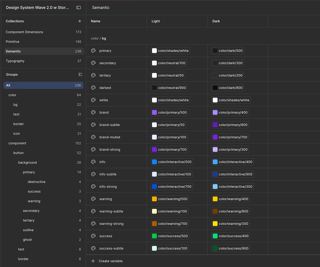
Primitive is the raw palette — every colour we own, numbered:
primary/500, neutral/100, dark/500. Nothing in the
product points at it directly.
Semantic sits on top and says what a colour is for:
bg.primary, text.primary. Each of those names holds two
references into the palette, one per theme — so
dark mode is that second column, not a second design.
One of each, built on Base UI.
Wylo’s look on top.
The duplicates are gone — one button, one input, one dialog. Base UI sits underneath and handles accessibility and keyboard behaviour, which was our senior architect’s call.
I opened up its variables, styled them to look like Wylo already looked, and built the Figma library from that same set. 37 components, 38 matching pages in Figma, one version of each.
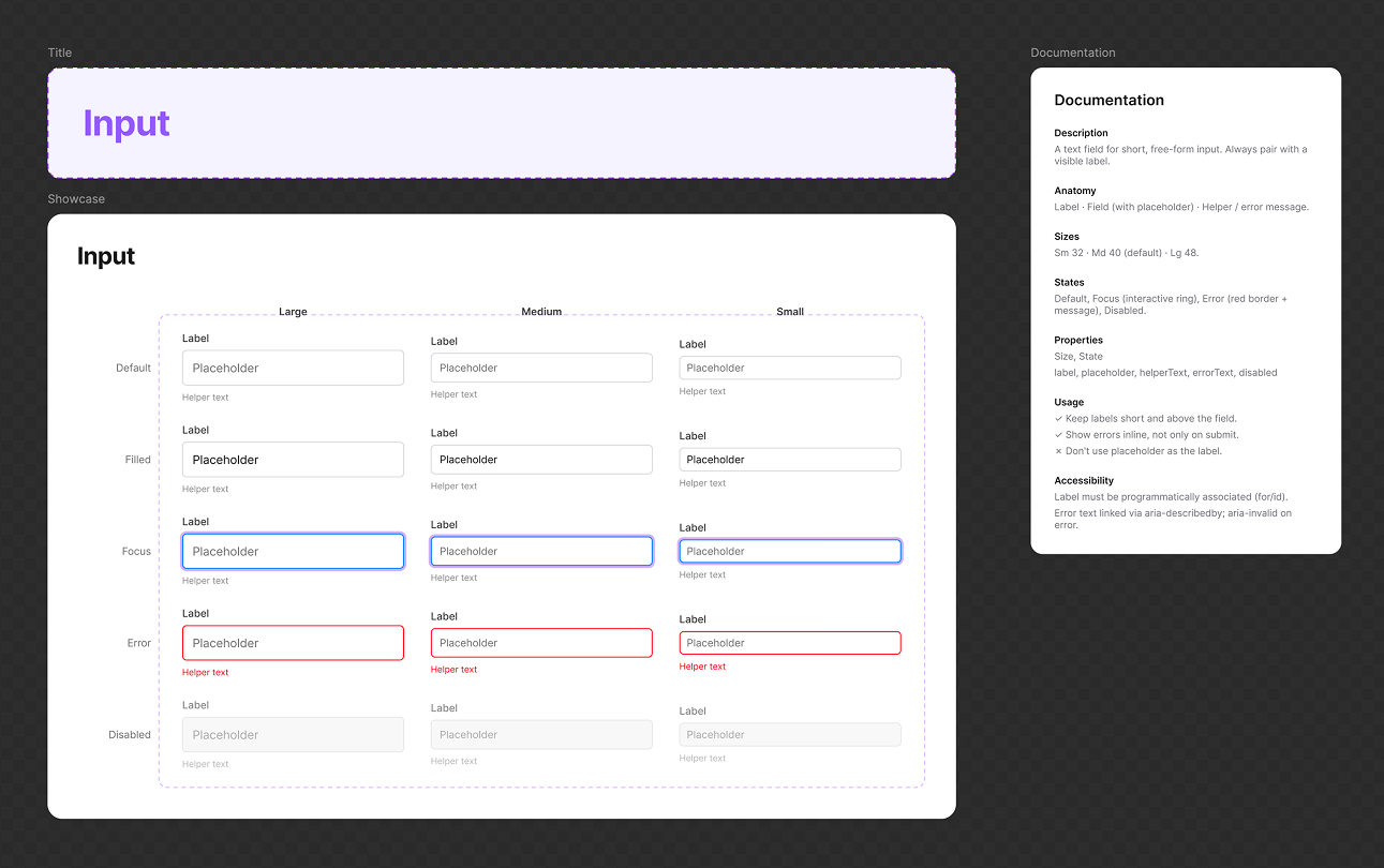 In Figma · every variant
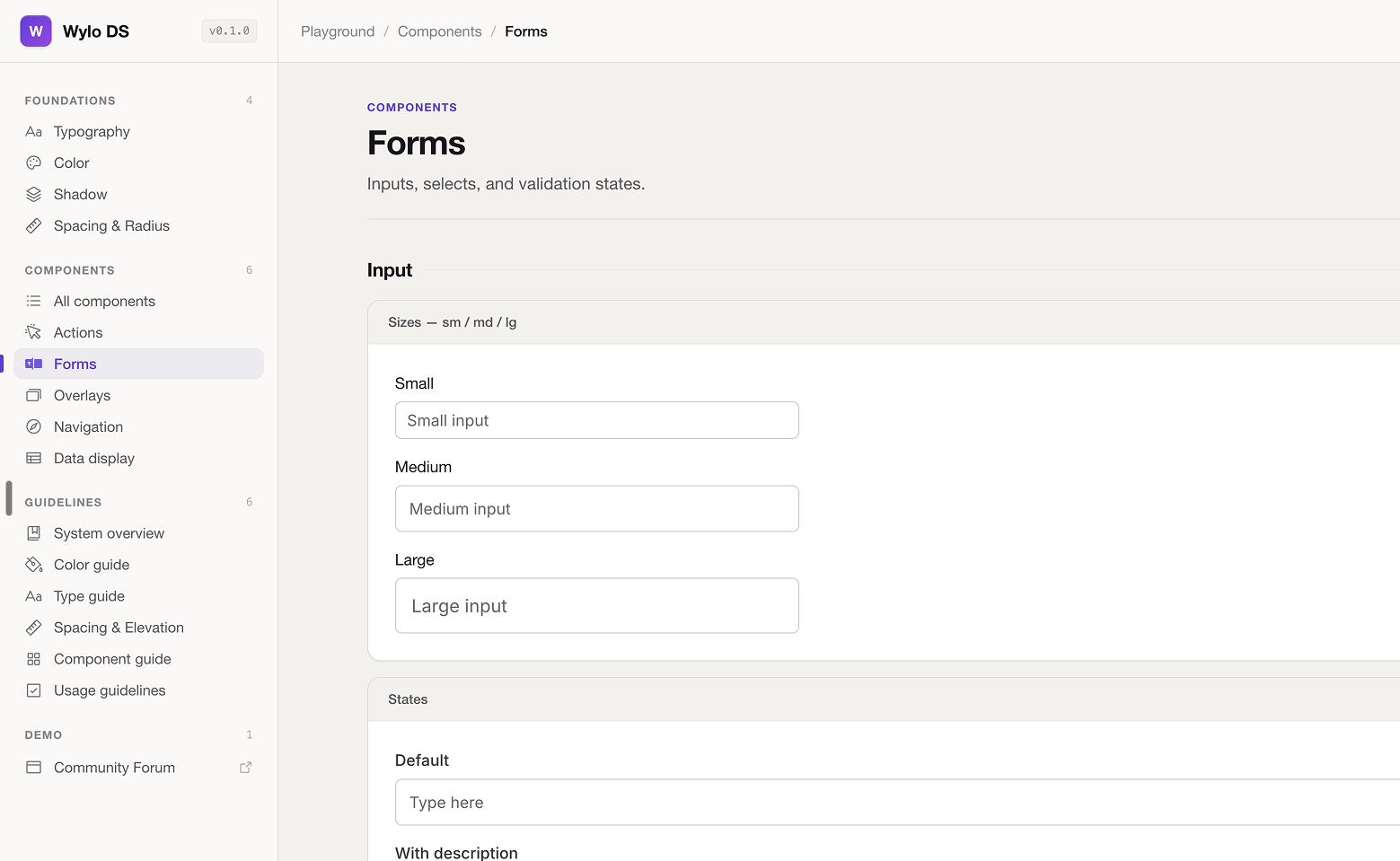 In the playground · the same input
A stable version,
and a place to experiment.
Storybook is the stable copy: the components developers build from, so nothing half-finished goes in it.
The playground is the opposite — a link anyone can open and switch the font, the corner radius, the theme. I built it so the CEO could try those himself, and some of the same controls are meant to reach clients next.
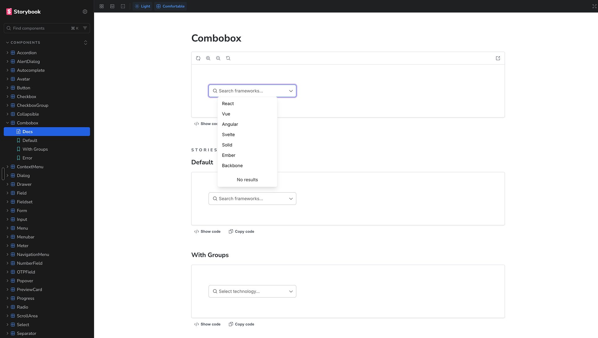 Storybook · what developers build from
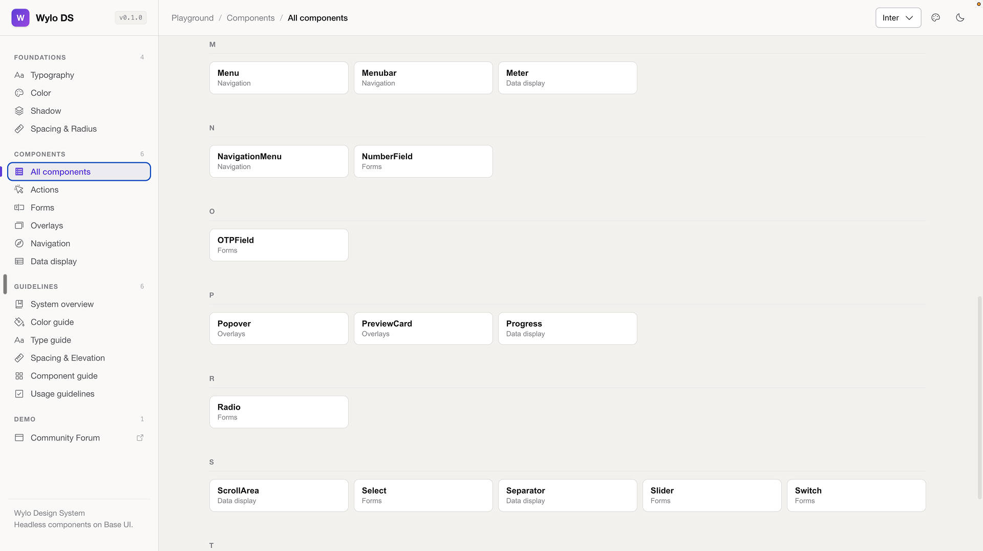 Playground · fonts, radius, themes
Clients pay to make Wylo look like theirs, so the asks keep coming. The playground lets us try one before we promise it.
How we design and build
a workflow now.
This was my answer to the second question. AI runs at both ends — a few wireframes to react to at the start, the build at the other — and the design decisions in the middle stay mine.
Still an experiment — nothing from these two has shipped yet
I do this in Claude Code and Cursor. I write and review the code, and a senior developer approves everything before it goes in.
Three days down to
about a day and a half.
We timed it on a real 15 screen workflow, then again on a second one, and both came out about the same. The time goes because nobody rebuilds a component or picks a colour by hand any more — the screens are assembled from things that already exist.
Frontend build · 15 screen workflow
and it held up the second time too
These are our own numbers from our own work, not a controlled test.
Thank you
This is the short version of a month of work — the tokens, the components, the playground, and the workflow that came out of them. Happy to go deeper on any of it.
For anything you want to dig into
satadal963@gmail.comSatadal Mazumdar · Product designer and design engineer